Light & tone
Soft daylight, crisp directional light, low-key shadow and saturated colour each create a different visual rhythm. We choose a lighting family early so portraits, details and wider frames feel related when they appear together.
Selected work & studio studies
This selection shows the range of visual approaches the studio supports: clean portraiture, colour-led editorial work, environmental branding and the production spaces behind the finished frame.
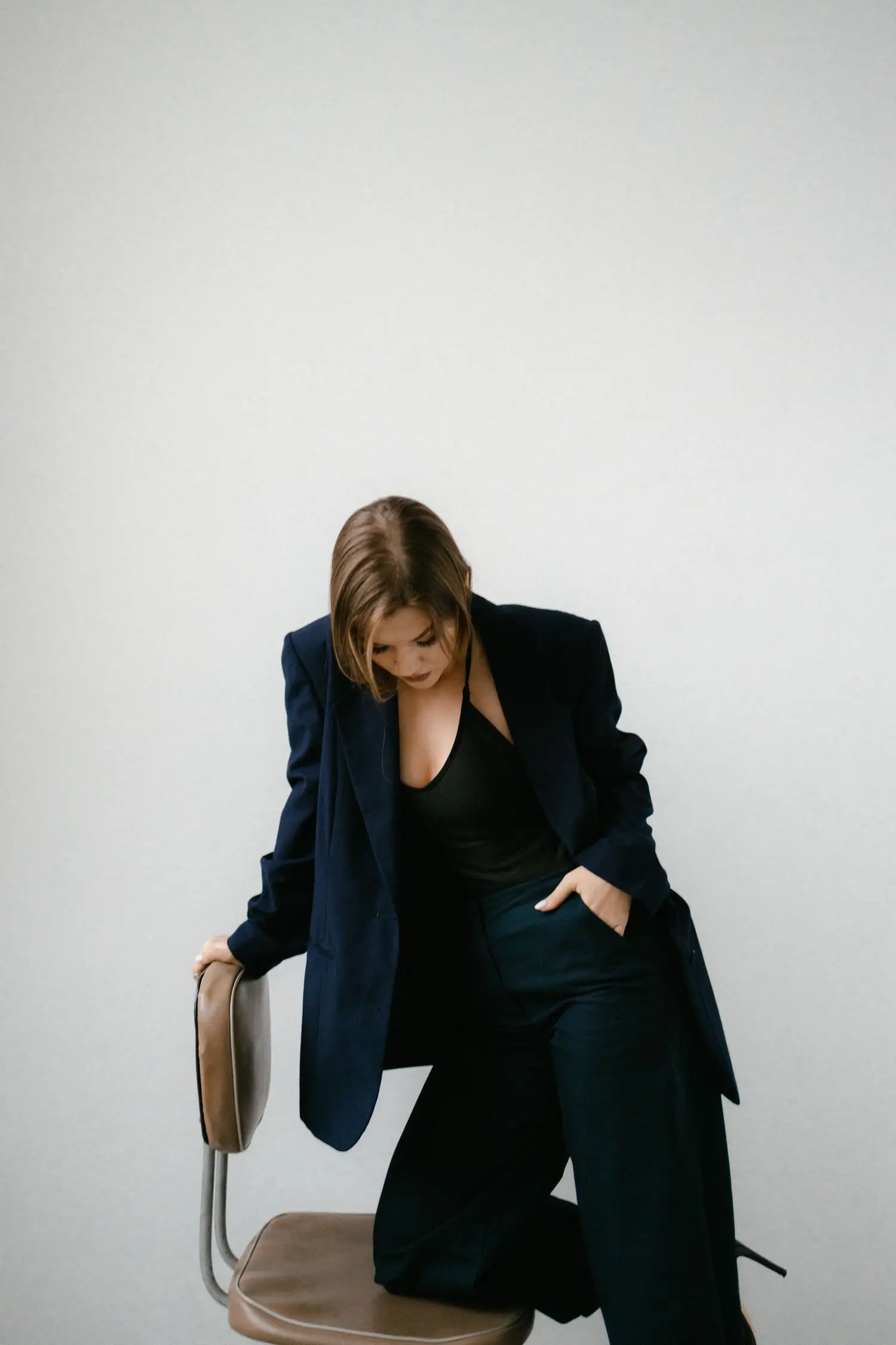
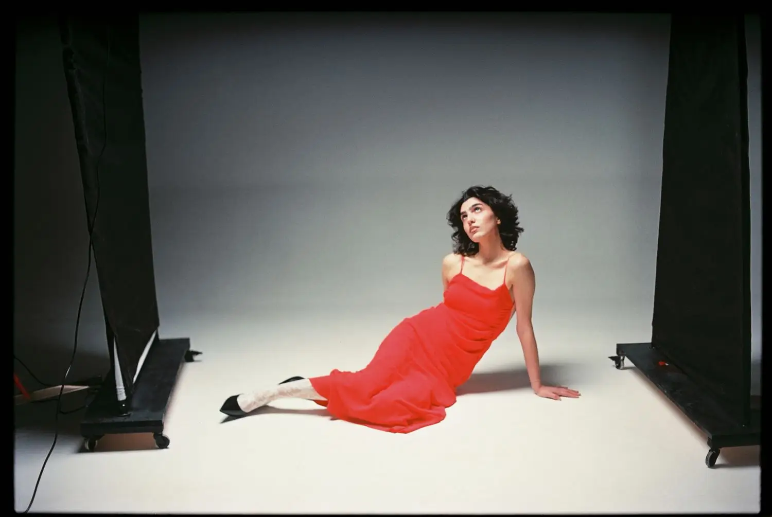
Controlled studio light with a minimal set.
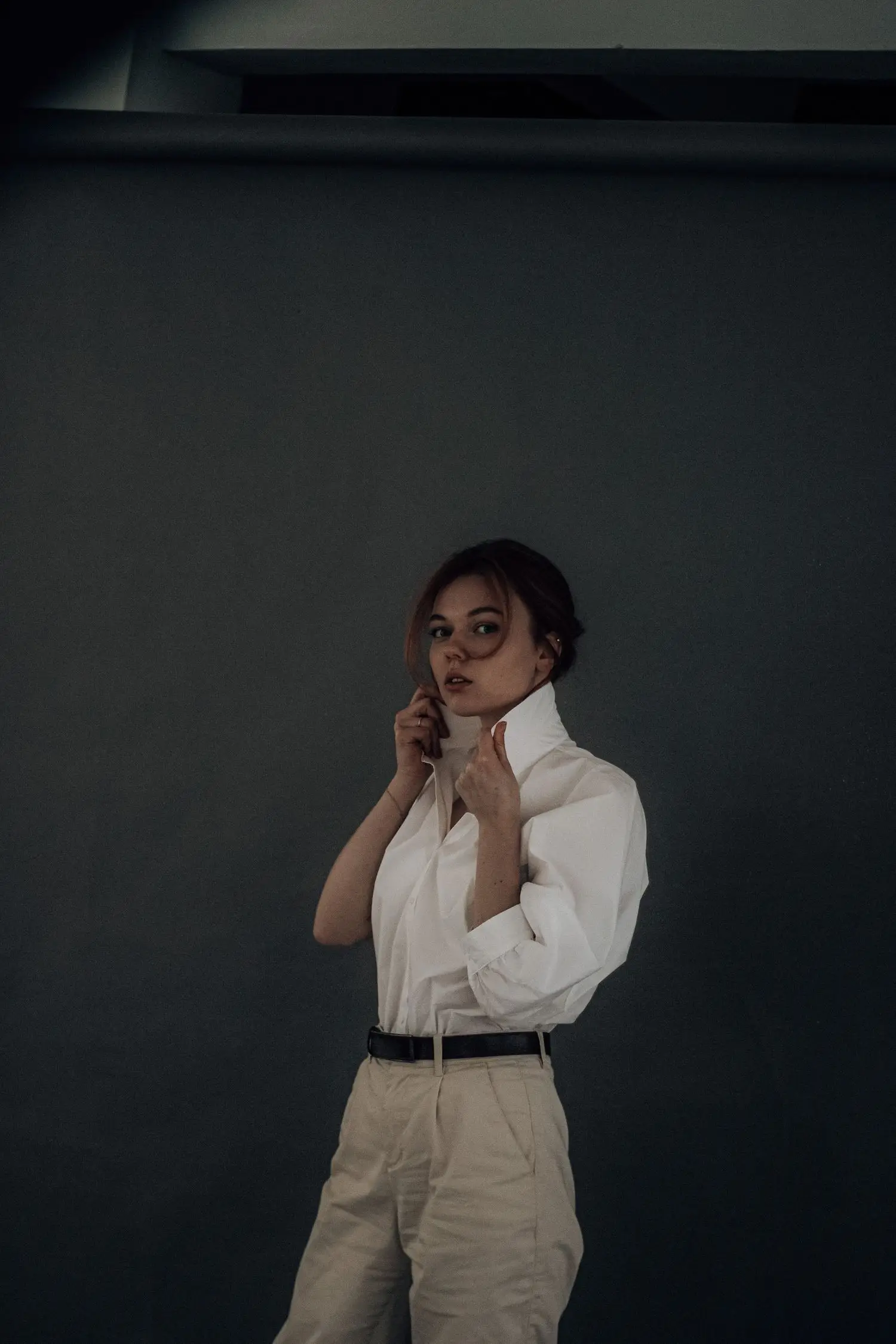
A quieter portrait built around shadow and expression.
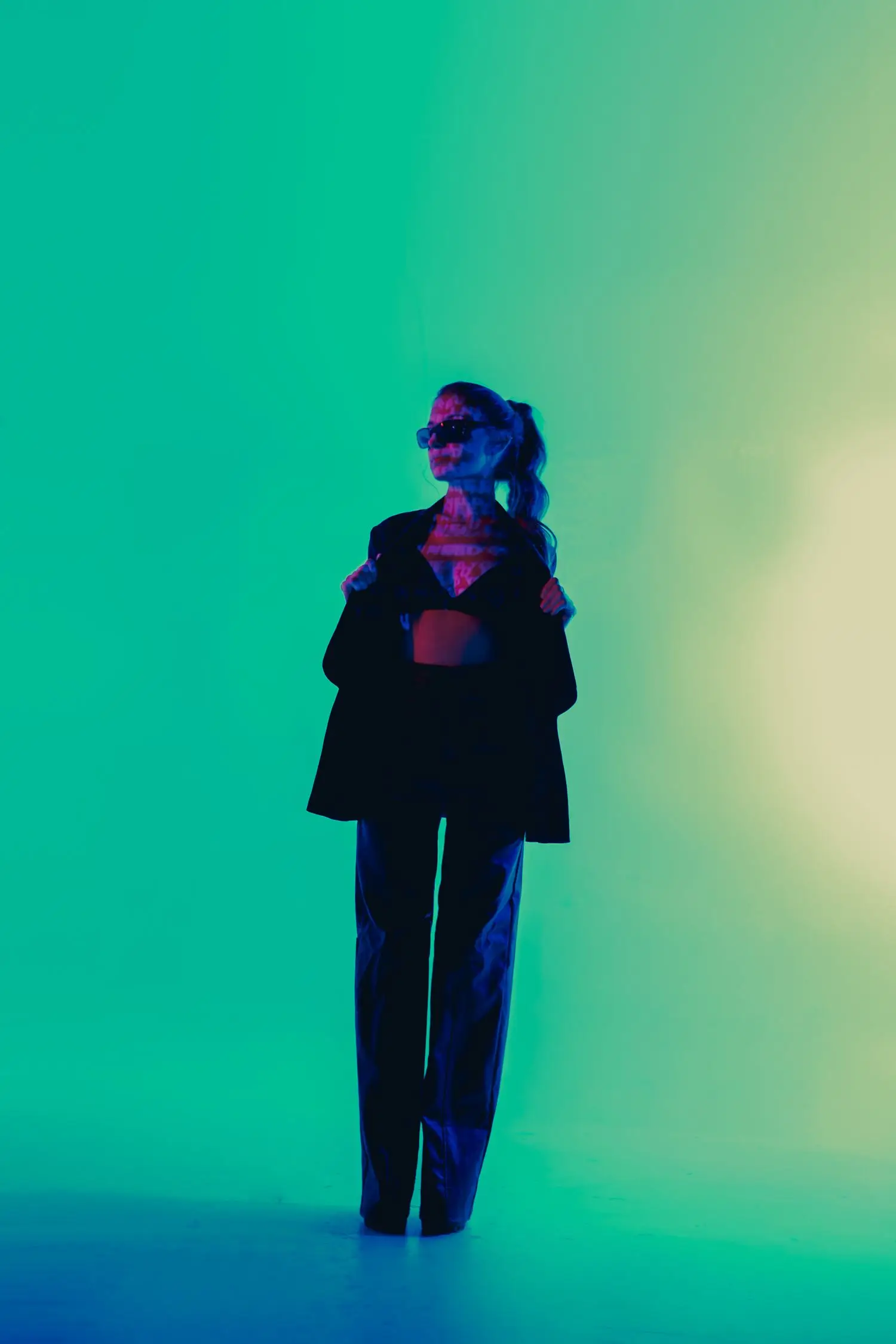
Saturated light used as a graphic part of the composition.
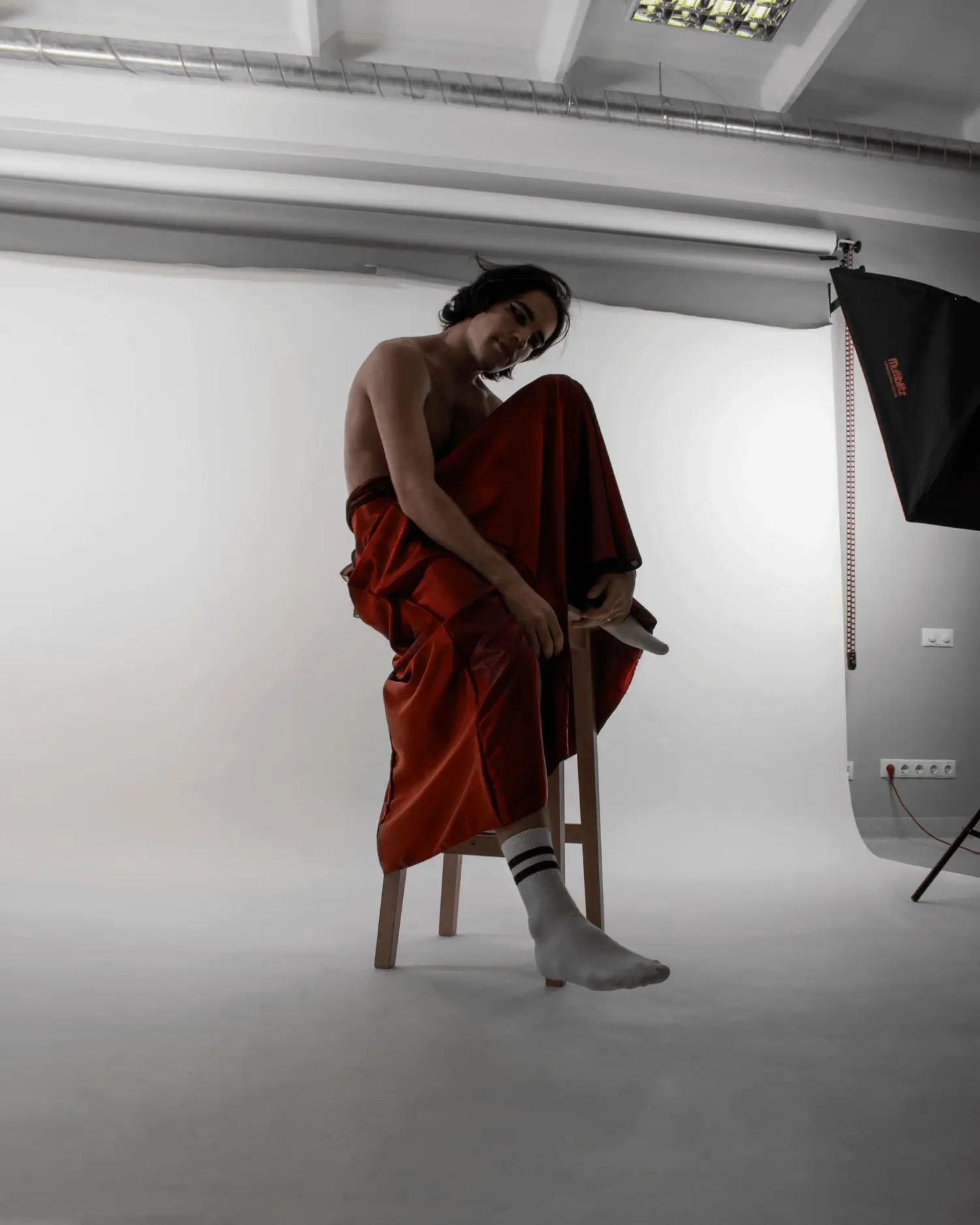
A full-length frame with space for gesture and fabric.
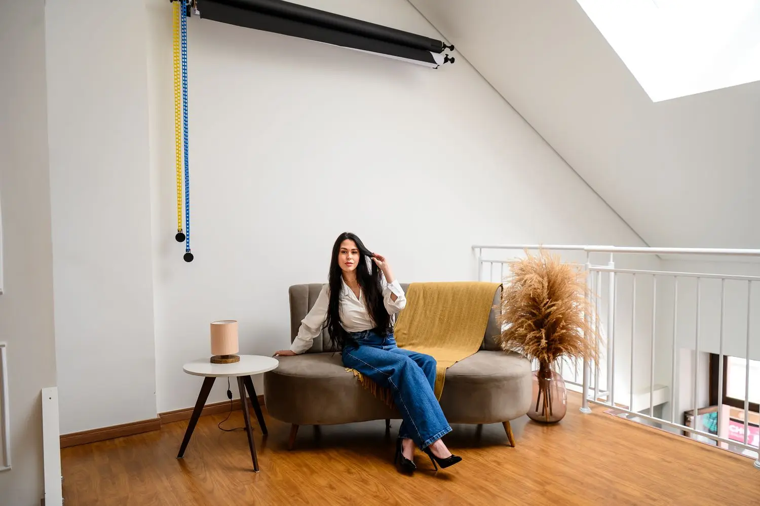
Natural architectural context for a professional portrait.
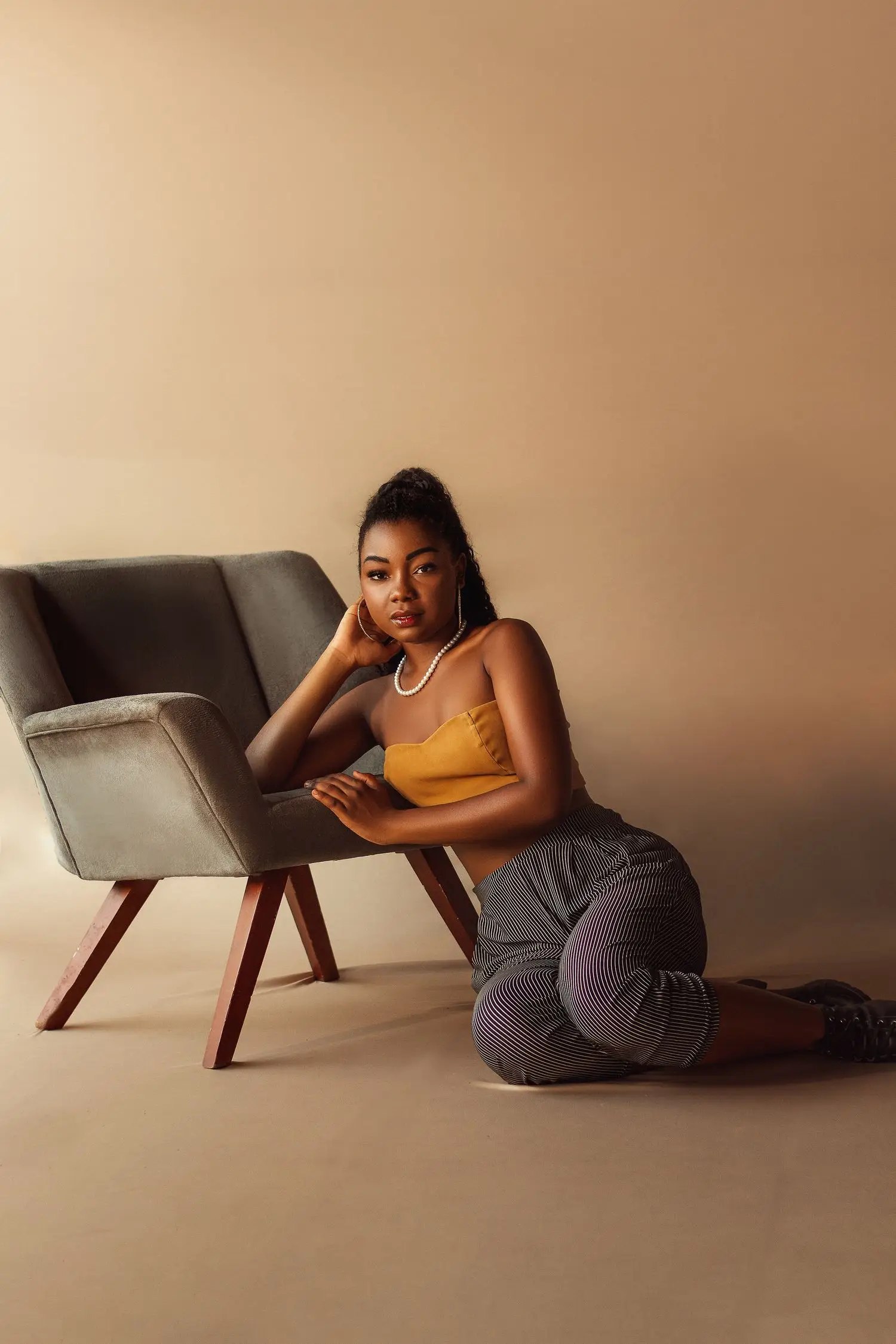
Simple styling and a neutral palette for flexible usage.
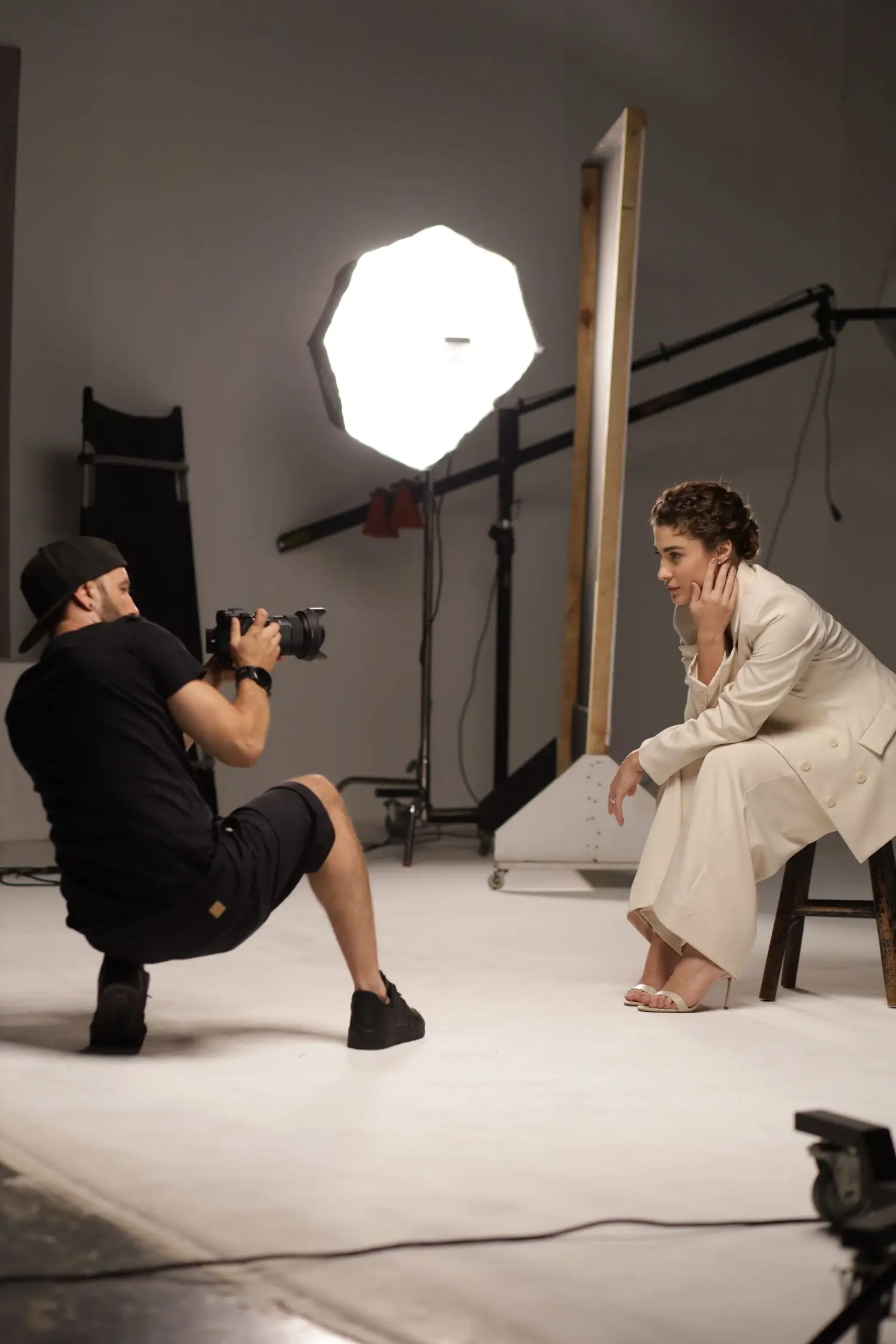
A working studio moment showing direction and light placement.
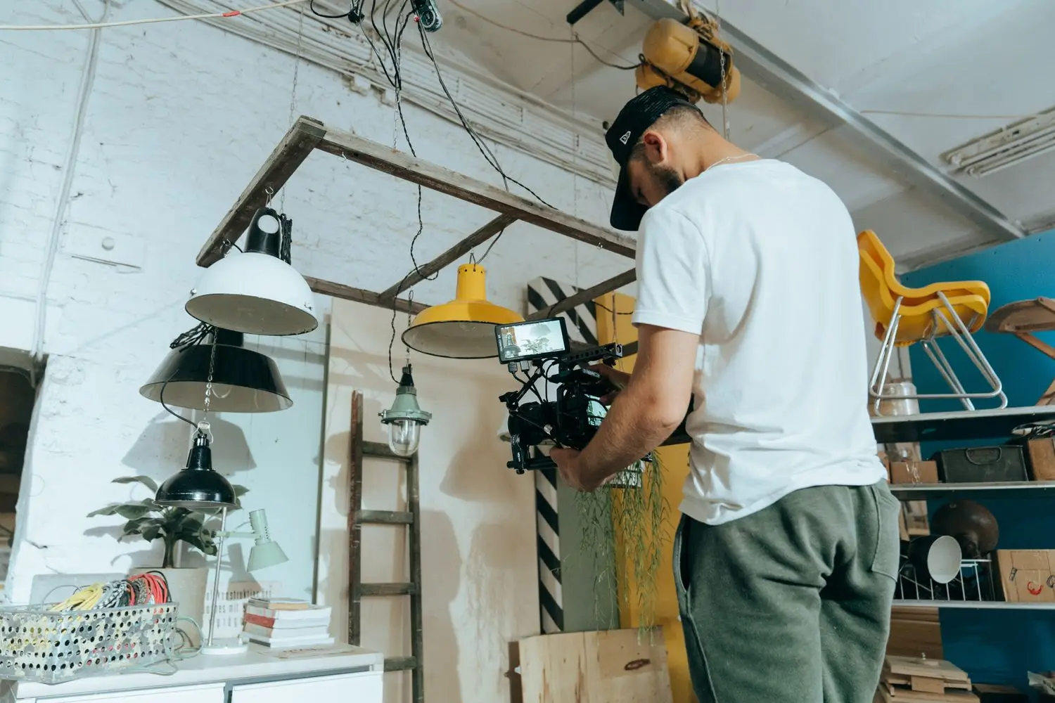
Lighting and set adjustments before the first frame.
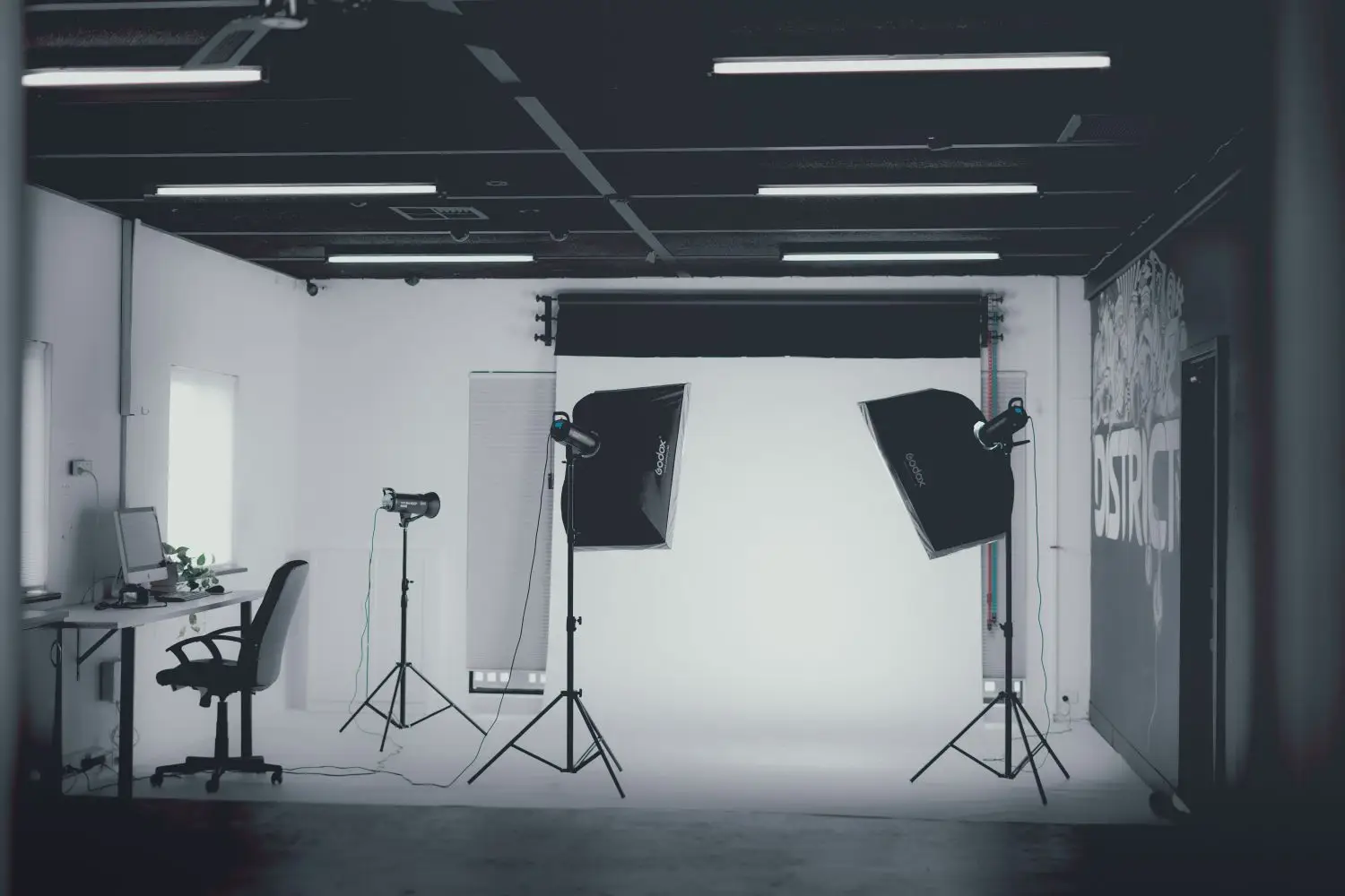
A flexible room prepared for portrait production.
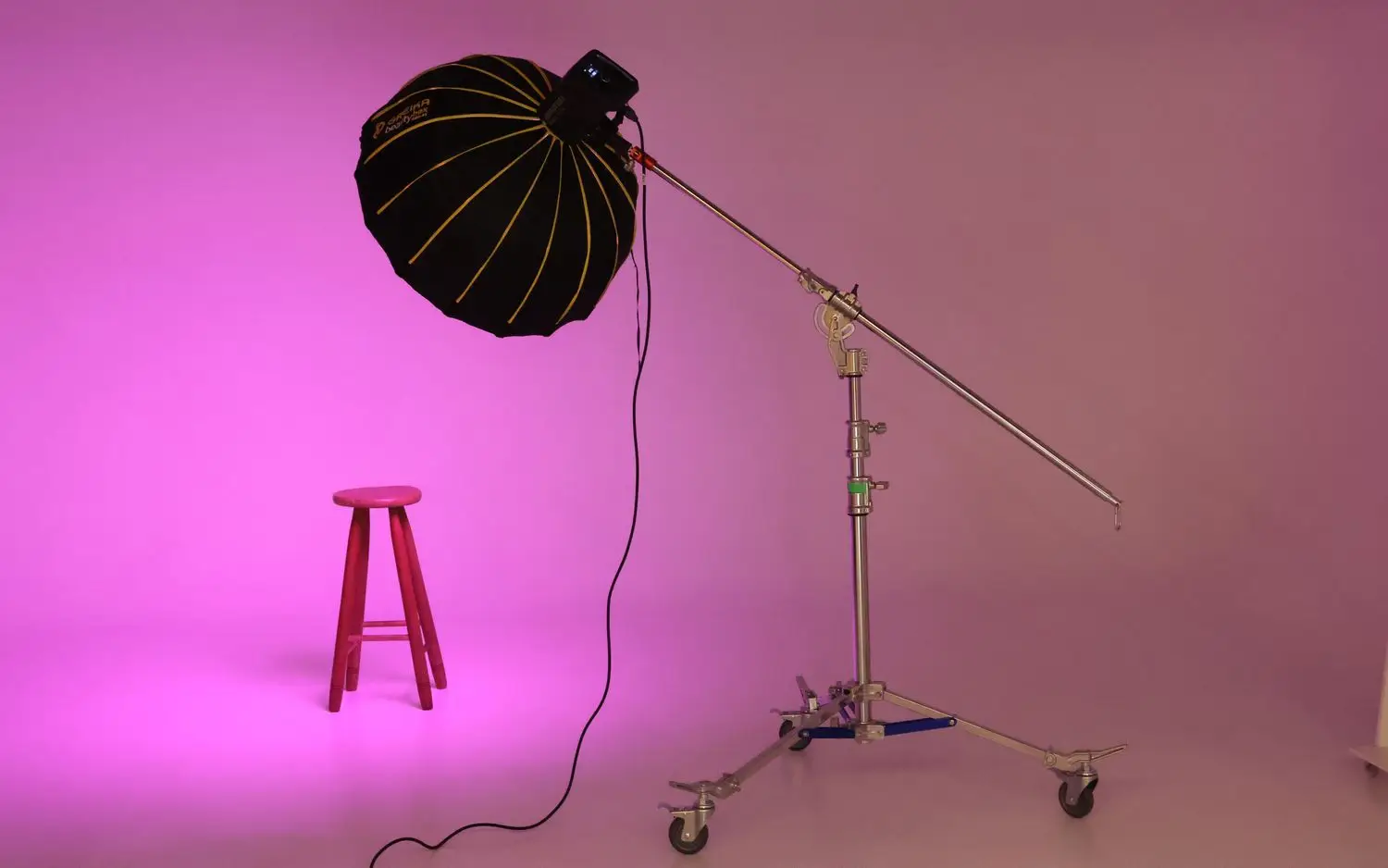
Gel lighting and a compact set for graphic portraits.
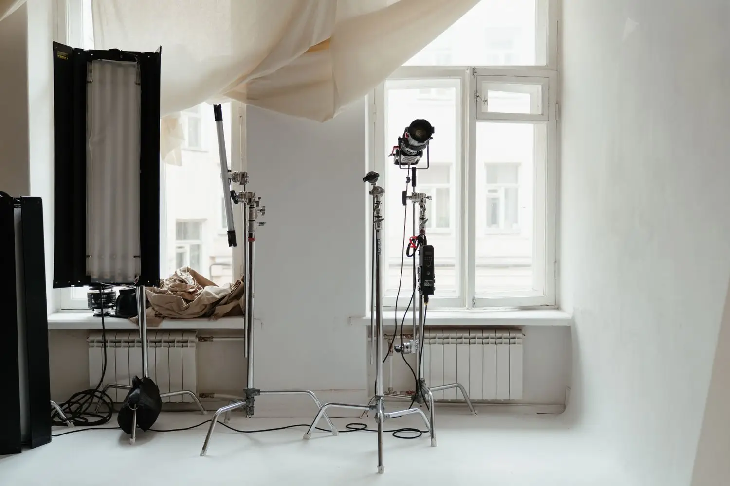
Open space for clean portrait and brand work.
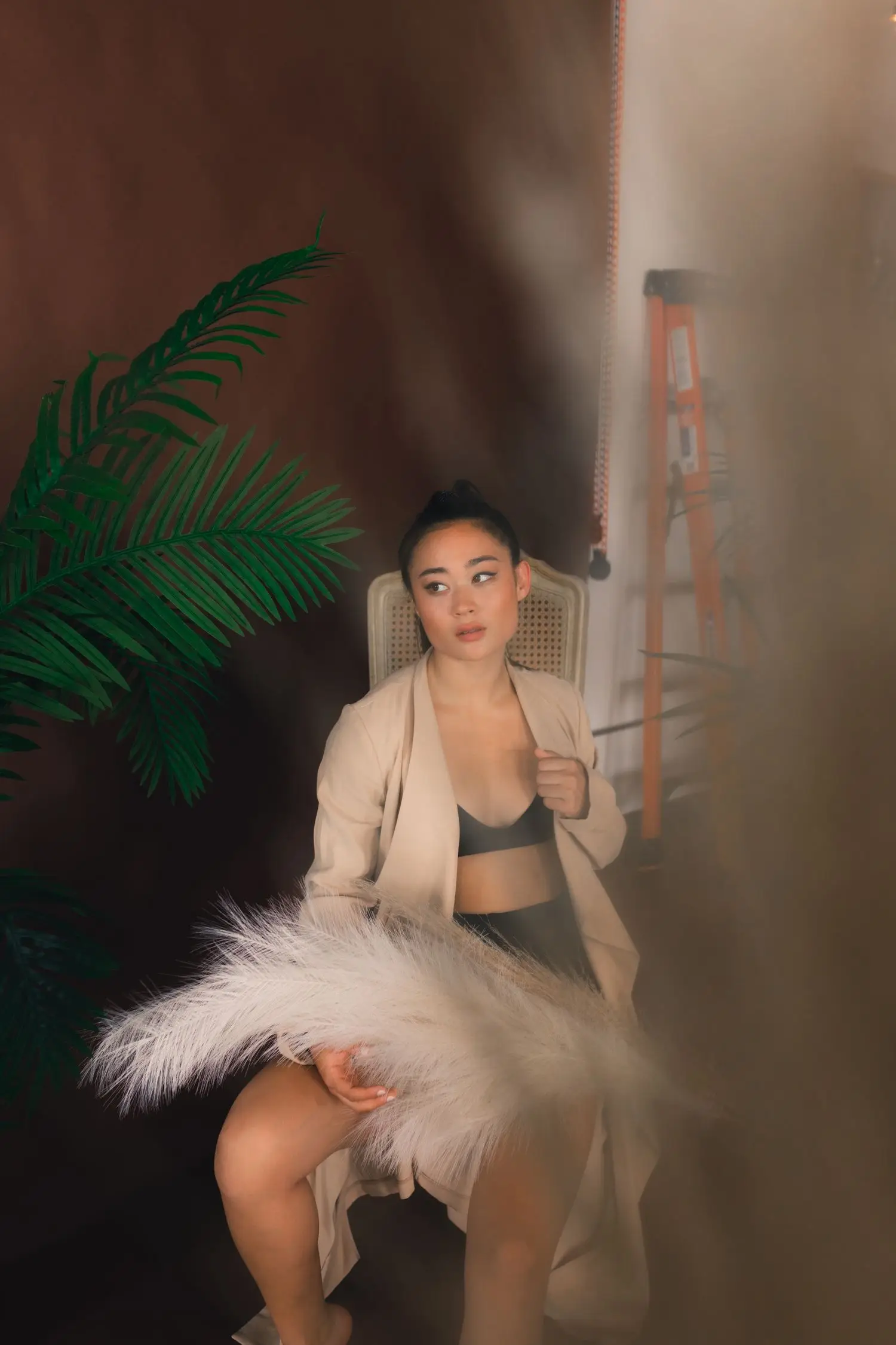
Texture, styling and softer directional light.
A coherent final set
Gallery breadth does not mean every session should contain every style. A strong set usually shares a consistent lighting idea, colour relationship or sense of space. During planning, we decide which variations belong together and which would make the final selection feel disconnected.
If you are booking for a website or personal brand, we also plan negative space and crop orientation so the photographs can work across banners, profile images, editorial layouts and smaller content blocks.
From reference to finished frame
A useful reference is more than an image you like. We break it into practical choices—light quality, background, camera distance, wardrobe contrast, movement and the amount of space around the subject—then adapt those choices to the person, brand or story in front of the camera.
Soft daylight, crisp directional light, low-key shadow and saturated colour each create a different visual rhythm. We choose a lighting family early so portraits, details and wider frames feel related when they appear together.
A portrait for a profile image needs different spacing from a website banner or campaign layout. We plan horizontal and vertical variations, useful negative space and close crops according to where the final photographs are expected to appear.
Direction can be quiet and minimal or more active and editorial. We build simple prompts around posture, gaze, movement and interaction so the session produces natural variation without losing the intended mood.
Editing with purpose
The strongest final set is rarely the largest possible set. During selection, repeated frames are reduced and complementary images are grouped so the delivery has a clear pace: establishing photographs, closer portraits, details and alternate expressions where they add useful choice.
For branding and editorial projects, consistency matters across the full group of images. Colour balance, contrast and finishing are approached as a system rather than as isolated effects, helping the photographs sit together across a website, press feature, portfolio or campaign.
When a project needs several distinct looks, we plan the transition between them before the session. That keeps wardrobe changes, set adjustments and lighting changes efficient and gives each look enough time to feel deliberate rather than rushed.
Use references well
We use references to understand light, mood and composition—not to duplicate another person’s photographs.